G2C — Government to Citizen
Elder Sahay
Direct-to-citizen welfare access for senior citizens, without middlemen.
- Role
- UX/UI Designer
- Duration
- 1 week
- Team
- Solo
- Status
- Ongoing
Outcome summary
A voice-first, accessible interface with one-tap emergency support and a missed-call IVR route for feature-phone users.
01 — Problem context
What was broken
- The problem
- Senior citizens aged 70+ struggle to access government benefits because of complex digital interfaces and mobility constraints, creating dependence on middlemen.
- Who was affected
- Senior citizens, their families, and local welfare administrators.
- Why it mattered
- Access failure here costs money, time, and dignity for people with the fewest alternatives.
02 — History
History of the project
- Before the project
- Benefit access depended on physically visiting offices or trusting an intermediary.
- The trigger
- Repeated reports of fund delays and exploitation by middlemen.
- Background
- An ongoing accessibility-led redesign of the benefit-access journey.
03 — Geography
User and context
- Target user
- Senior citizens aged 70+, often supported by a family member
- Age / role
- 70+, pensioners and welfare beneficiaries
- Environment
- Homes and villages with limited mobility and patchy connectivity
- Device
- Low-cost Android smartphones and feature phones
- Digital comfort
- Low — many are first-time or non-readers of digital interfaces
- Market context
- Indian public welfare distribution
- Where the problem happens
- Between benefit entitlement and actual receipt of aid
04 — Physics
Mechanics of the experience
- Main user journey
- Open or call → speak the request in a regional language → confirm → track → collect or receive aid.
- Top user tasks
- Book monthly ration
- Find the nearest shop with directions
- File a grievance
- Friction points
- Typing, small targets, dense text, and English-first labels.
- Information architecture
- Three primary actions on the home surface; everything else one level deeper.
- Where users got stuck
- Authentication and form entry — the classic drop-off point for this group.
- What I simplified
- Replaced typing with speech, and replaced menus with three large, spoken-labelled actions.
05 — Chemistry
Emotion and trust
- Feeling before
- Anxiety, dependence, and quiet humiliation.
- Fear or confusion
- Losing money or missing an entitlement because of a mistake on screen.
- Trust issue
- Middlemen were trusted out of necessity, not confidence.
- Target emotion
- Dignity and calm self-reliance.
- How design supported it
- Very large type, high contrast, generous touch targets, plain regional-language copy, and spoken confirmation after every action.
06 — Biology
Behaviour
- Repeated behaviour
- Handing the phone or documents to a younger relative or agent.
- Existing workaround
- Paying an intermediary to complete the process.
- Habit loop
- Need aid → ask middleman → pay a cut → wait → repeat monthly.
- Behaviour to change
- Shift the monthly loop from delegation to independent, voice-led self-service.
- Feedback loop created
- Spoken confirmation plus status tracking so users know the request landed.
07 — Mathematics
Proof and metrics
Research sample
12–15 participants planned — 70+ beneficiaries, caregivers, and ration-shop operators across rural and urban contexts.
Usability sample
5–7 users aged 70+ — Validate voice navigation, home delivery booking, benefit status, and help flows.
Task completion
Target: ≥90% — Users should complete key tasks without assistance, including booking delivery and checking benefits.
Time saved
Target: 60–70% reduction — Replace long queues and repeated visits with scheduled doorstep delivery.
Errors reduced
Target: ≥50% fewer errors — Reduce biometric failures, incorrect bookings, and missed benefit claims through simpler flows.
User confidence
Target: ≥4/5 confidence — Users should feel comfortable completing essential tasks independently.
Strongest user quote
To be captured through user research. Focus on independence, dignity, and reduced dependence on middlemen.
Business / user impact
Designed to reduce intermediary dependency, improve benefit transparency, and make monthly welfare access more accessible.
Still to validate
Independent task completion, adoption of voice/IVR, delivery reliability, biometric success, and reduction in middleman involvement.
08 — Design engineering
How it was built
- 01Problem framing around access barriers and mobility constraints
- 02Voice-first flow mapping in regional languages
- 03Accessible wireframes with oversized targets and type
- 04Design system tuned for contrast and legibility
- 05Prototype with spoken confirmation states
- 06Missed-call IVR path for feature phones
- 07Ongoing iteration
09 — STAR story
Situation, task, action, result
Situation
Enhancing Accessibility and User Experience for Government Ration Shop Services, with a Focus on Elderly and Vulnerable Citizens
Task
Millions of senior citizens (70+) struggle to access government benefits due to complex digital interfaces and physical mobility constraints. This technology barrier creates unhealthy reliance on local middlemen, leading to fund delays, financial exploitation, and loss of dignity.
Action
Developed an accessible, direct-to-citizen solution that eliminates middlemen and delivers government aid directly into senior citizens' hands, safely and independently.
Result
A digital interface for users with smartphones or family support: a voice-first interface where users speak in their regional language (for example, 'Book my ration for this month') instead of typing; one-tap emergency call to 14445; nearest shop with directions; grievance filing; and a missed-call IVR option for feature-phone users.
10 — Transformation
Before and after
Before
Aid mediated by an intermediary, with delays and deductions.
After
A spoken request, a confirmation, and aid received directly.
Transformation
From dependence to independent access, with dignity intact.
11 — Final screens
Screen gallery
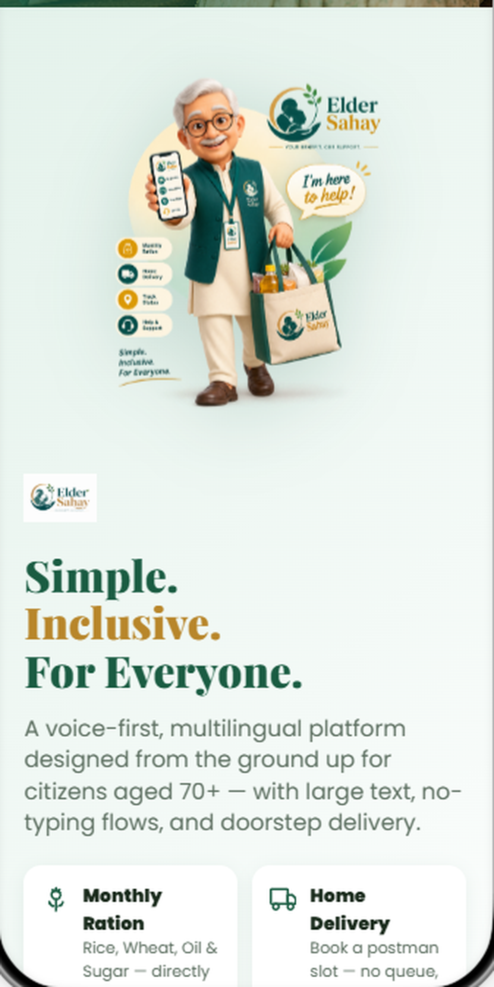
Interactive walkthrough
Simple. Inclusive. For everyone.
A voice-first, multilingual entry point written in plain language, with no typing anywhere in the flow.
Screen 1 of 10
12 — Learnings
What I took away
- What I learned
- For this group, accessibility is the product — not a compliance layer.
- What I would improve
- Test with 70+ users in low-connectivity settings before the next iteration.
- Future scope
- Expand language coverage and add caregiver-assisted accounts.
Want the thinking behind this work?
Resume: /__l5e/assets-v1/46a1be5c-d256-45fc-b026-b2685ed1fe32/Sajeesh_Resume.pdf · LinkedIn: https://www.linkedin.com/in/sajeesh-subramanian-b4047274/